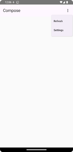
Drop-down menus let users click an icon, text field, or other component, and then select from a list of options on a temporary surface. This guide describes how to create both basic menus and more complex menus with dividers and icons.

API surface
Use DropdownMenu, DropdownMenuItem, and the IconButton
components to implement a custom drop-down menu. The DropdownMenu and
DropdownMenuItem components are used to display the menu items, while the
IconButton is the trigger to display or hide the drop down menu.
The key parameters for the DropdownMenu component include the following:
expanded: Indicates whether the menu is visible.onDismissRequest: Used to handle menu dismissal.content: The composable content of the menu, typically containingDropdownMenuItemcomposables.
The key parameters for DropdownMenuItem include the following:
text: Defines the content displayed in the menu item.onClick: Callback to handle interaction with the item in the menu.
Create a basic drop-down menu
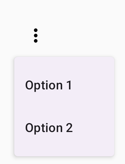
The following snippet demonstrates a minimal DropdownMenu implementation:
@Composable fun MinimalDropdownMenu() { var expanded by remember { mutableStateOf(false) } Box( modifier = Modifier .padding(16.dp) ) { IconButton(onClick = { expanded = !expanded }) { Icon(Icons.Default.MoreVert, contentDescription = "More options") } DropdownMenu( expanded = expanded, onDismissRequest = { expanded = false } ) { DropdownMenuItem( text = { Text("Option 1") }, onClick = { /* Do something... */ } ) DropdownMenuItem( text = { Text("Option 2") }, onClick = { /* Do something... */ } ) } } }
Key points about the code
- Defines a basic
DropdownMenucontaining two menu items. - The
expandedparameter controls the menu's visibility as expanded or collapsed. - The
onDismissRequestparameter defines a callback that executes when the user closes the menu. - The
DropdownMenuItemcomposable represents selectable items in the drop-down menu. - An
IconButtontriggers the expansion and collapse of the menu.
Result

Create a longer drop-down menu
DropdownMenu is scrollable by default if all the menu items can't be displayed
at once. The following snippet creates a longer, scrollable drop-down menu:
@Composable fun LongBasicDropdownMenu() { var expanded by remember { mutableStateOf(false) } // Placeholder list of 100 strings for demonstration val menuItemData = List(100) { "Option ${it + 1}" } Box( modifier = Modifier .padding(16.dp) ) { IconButton(onClick = { expanded = !expanded }) { Icon(Icons.Default.MoreVert, contentDescription = "More options") } DropdownMenu( expanded = expanded, onDismissRequest = { expanded = false } ) { menuItemData.forEach { option -> DropdownMenuItem( text = { Text(option) }, onClick = { /* Do something... */ } ) } } } }
Key points about the code
- The
DropdownMenuis scrollable when the total height of its content exceeds the available space. This code creates a scrollableDropdownMenuthat displays 100 placeholder items. - The
forEachloop dynamically generatesDropdownMenuItemcomposables. The items are not lazily created, which means that all 100 drop-down items are created and exist in the composition. - The
IconButtontriggers the expansion and collapse of theDropdownMenuwhen clicked. - The
onClicklambda within eachDropdownMenuItemlets you define the action performed when the user selects a menu item.
Result
The preceding code snippet produces the following scrollable menu:

Create a longer drop-down menu with dividers
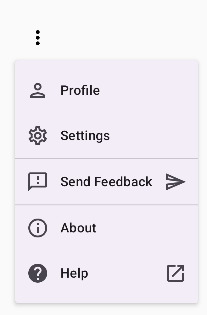
The following snippet shows a more advanced implementation of a drop-down menu. In this snippet, leading and trailing icons are added to menu items, and dividers separate groups of menu items.
@Composable fun DropdownMenuWithDetails() { var expanded by remember { mutableStateOf(false) } Box( modifier = Modifier .fillMaxWidth() .padding(16.dp) ) { IconButton(onClick = { expanded = !expanded }) { Icon(Icons.Default.MoreVert, contentDescription = "More options") } DropdownMenu( expanded = expanded, onDismissRequest = { expanded = false } ) { // First section DropdownMenuItem( text = { Text("Profile") }, leadingIcon = { Icon(Icons.Outlined.Person, contentDescription = null) }, onClick = { /* Do something... */ } ) DropdownMenuItem( text = { Text("Settings") }, leadingIcon = { Icon(Icons.Outlined.Settings, contentDescription = null) }, onClick = { /* Do something... */ } ) HorizontalDivider() // Second section DropdownMenuItem( text = { Text("Send Feedback") }, leadingIcon = { Icon(Icons.Outlined.Feedback, contentDescription = null) }, trailingIcon = { Icon(Icons.AutoMirrored.Outlined.Send, contentDescription = null) }, onClick = { /* Do something... */ } ) HorizontalDivider() // Third section DropdownMenuItem( text = { Text("About") }, leadingIcon = { Icon(Icons.Outlined.Info, contentDescription = null) }, onClick = { /* Do something... */ } ) DropdownMenuItem( text = { Text("Help") }, leadingIcon = { Icon(Icons.AutoMirrored.Outlined.Help, contentDescription = null) }, trailingIcon = { Icon(Icons.AutoMirrored.Outlined.OpenInNew, contentDescription = null) }, onClick = { /* Do something... */ } ) } } }
This code defines a DropdownMenu within a Box.
Key points about the code
- The
leadingIconandtrailingIconparameters add icons to the start and end of aDropdownMenuItem. - An
IconButtontriggers the menu's expansion. - The
DropdownMenucontains severalDropdownMenuItemcomposables, each representing a selectable action. HorizontalDividercomposables insert a horizontal line to separate groups of menu items.
Result
The preceding snippet produces a drop-down menu with icons and dividers:

Additional resources
- Material Design: Menus
