Dividers are thin lines that separate items in lists or other
containers. You can implement dividers in your app using the HorizontalDivider
and VerticalDivider composables.
HorizontalDivider: Separate items in a column.VerticalDivider: Separate items in a row.
API surface
Both components provide parameters for modifying their appearance:
thickness: Use this parameter to specify the thickness of the divider line.color: Use this parameter to specify the color of the divider line.
Horizontal divider example
The following example demonstrates an implementation of the
HorizontalDivider component. It uses the thickness parameter to control the
height of the line:
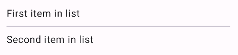
@Composable fun HorizontalDividerExample() { Column( verticalArrangement = Arrangement.spacedBy(8.dp), ) { Text("First item in list") HorizontalDivider(thickness = 2.dp) Text("Second item in list") } }
This implementation renders a thin horizontal line between two text components:
Vertical divider example
The following example demonstrates an implementation of the
VerticalDivider component. It uses the color parameter to provide a custom
color for the line:
@Composable fun VerticalDividerExample() { Row( modifier = Modifier .fillMaxWidth() .height(IntrinsicSize.Min), horizontalArrangement = Arrangement.SpaceEvenly ) { Text("First item in row") VerticalDivider(color = MaterialTheme.colorScheme.secondary) Text("Second item in row") } }
This implementation renders a thin vertical line between two text components: