
Use a badge to display a small visual element to denote status or a numeric value on another composable. Here are a few common scenarios where you might use a badge:
- Notifications: Display the number of unread notifications on an app icon or notification bell.
- Messages: Indicate new or unread messages within a chat application.
- Status updates: Show the status of a task, such as "complete," "in progress," or "failed."
- Cart quantity: Display the number of items in a user's shopping cart.
- New content: Highlight new content or features available to the user.

API surface
Use the BadgedBox composable to implement badges in your application. It
is ultimately a container. You control its appearance with these two main
parameters:
content: The composable content that theBadgedBoxcontains. TypicallyIcon.badge: The composable that appears as the badge over the content. Typically the dedicatedBadgecomposable.
Basic example
This code snippet shows a basic implementation of BadgedBox:
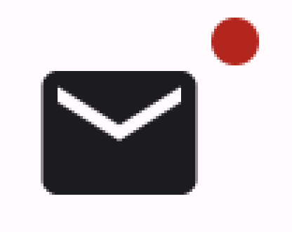
@Composable fun BadgeExample() { BadgedBox( badge = { Badge() } ) { Icon( imageVector = Icons.Filled.Mail, contentDescription = "Email" ) } }
This example displays a badge that overlaps the provided Icon composable. Note
the following in the code:
BadgedBoxserves as the overall container.- The argument for the
badgeparameter ofBadgedBoxisBadge. BecauseBadgehas no arguments of its own, the app displays the default badge, which is a small red circle. Iconserves as the argument for thecontentparameter ofBadgedBox. It is the icon over which the badge appears. In this case, it is a mail icon.
This is how it appears:
Detailed example
The following snippet demonstrates how you can display values in the badge that respond to user actions.
@Composable fun BadgeInteractiveExample() { var itemCount by remember { mutableStateOf(0) } Column( verticalArrangement = Arrangement.spacedBy(16.dp) ) { BadgedBox( badge = { if (itemCount > 0) { Badge( containerColor = Color.Red, contentColor = Color.White ) { Text("$itemCount") } } } ) { Icon( imageVector = Icons.Filled.ShoppingCart, contentDescription = "Shopping cart", ) } Button(onClick = { itemCount++ }) { Text("Add item") } } }
This example implements a shopping cart icon with a badge that displays the number of items in the user's cart.
- The
BadgedBoxdisplays only when the item count is over 0. - The arguments for
containerColorandcontentColorcontrol the appearance of the badge. - The
Textcomposable for the content slot ofBadgeappears within the badge. In this case, it displays the number of items in the cart.
This implementation appears as follows:
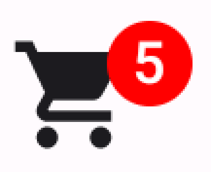