This page includes details for optional widget enhancements that are available starting in Android 12 (API level 31). These features are optional, but they're straightforward to implement and improve your users' widget experience.
Use dynamic colors
Starting in Android 12, a widget can use the device theme colors for buttons, backgrounds, and other components. This provides smoother transitions and consistency across different widgets.
There are two ways to achieve dynamic colors:
Use the system's default theme (
@android:style/Theme.DeviceDefault.DayNight) in the root layout.Use the Material 3 theme (
Theme.Material3.DynamicColors.DayNight) from the Material Components for Android library, available starting in Material Components for Android v1.6.0.
Once the theme is set in the root layout, you can use common color attributes in the root or any of its children to pick up the dynamic colors.
Some examples of color attributes you can use are the following:
?attr/primary?attr/primaryContainer?attr/onPrimary?attr/onPrimaryContainer
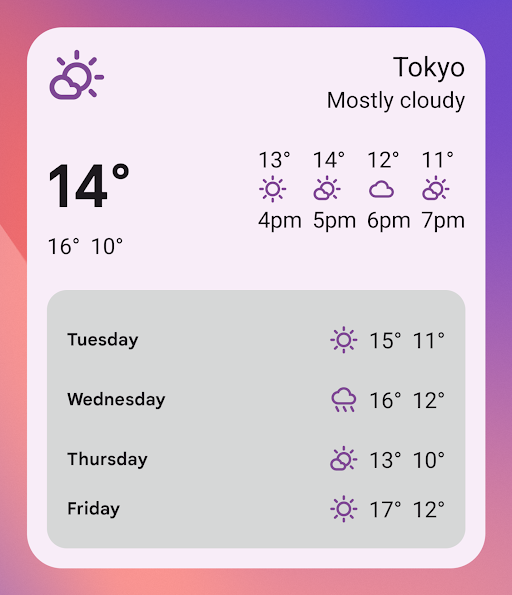
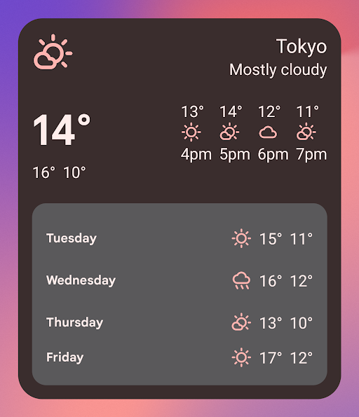
In the following example using the Material 3 theme, the device's theme color is "purplish." The accent color and widget background adapt for light and dark modes, as shown in figures 1 and 2.
<LinearLayout xmlns:android="http://schemas.android.com/apk/res/android"
  xmlns:app="http://schemas.android.com/apk/res-auto"
  android:layout_width="match_parent"
  android:layout_height="match_parent"
  android:background="?attr/colorPrimaryContainer"
  android:theme="@style/Theme.Material3.DynamicColors.DayNight">

  <ImageView
    ...
    app:tint="?attr/colorPrimaryContainer"
    android:src="@drawable/ic_partly_cloudy" />

    <!-- Other widget content. -->

</LinearLayout>


Backward compatibility for dynamic colors
Dynamic colors are only available in devices running Android 12
or higher. To provide a custom theme for lower versions, create a default theme
with your custom colors and a new qualifier (values-v31) using the default
theme attributes.
Here is an example using the Material 3 theme:
/values/styles.xml
<resources>
  <style name="MyWidgetTheme" parent="Theme.Material3.DynamicColors.DayNight">
    <!-- Override default colorBackground attribute with custom color. -->
    <item name="android:colorBackground">@color/my_background_color</item>

    <!-- Add other colors/attributes. -->

  </style>
</resources>
/values-v31/styles.xml
<resources>
  <!-- Do not override any color attribute. -->
  <style name="MyWidgetTheme" parent="Theme.Material3.DynamicColors.DayNight" />
</resources>
/layout/my_widget_layout.xml
<resources>
  <LinearLayout xmlns:android="http://schemas.android.com/apk/res/android"
    ...
    android:background="?android:attr/colorBackground"
    android:theme="@style/MyWidgetTheme" />
</resources>
Enable voice support
App Actions let Google Assistant display widgets in response to relevant user voice commands. By configuring your widget to respond to built-in intents (BIIs), your app can proactively display widgets on Assistant surfaces such as Android and Android Auto. Users have the option to pin widgets displayed by Assistant to their launcher, encouraging future engagement.
For example, you can configure the workout summary widget for your exercise app
to fulfill the user voice commands that trigger the
GET_EXERCISE_OBSERVATION
BII. Assistant proactively displays your widget when users trigger this BII by
making requests like, "Hey Google, how many miles did I run this week on
ExampleApp?"
There are dozens of BIIs covering several categories of user interaction, letting almost any Android app enhance their widgets for voice. To get started, see Integrate App Actions with Android widgets.
Improve your app's widget picker experience
Android 12 lets you add scaled widget previews and widget descriptions. Android 15 lets you improve the widget picker experience for your app with generated widget previews.
To improve your app's widget picker experience, provide a generated widget
preview on Android 15 and later devices, a scaled widget preview
(by specifying a previewLayout) for Android 12 to
Android 14 devices, and a previewImage for earlier versions.
Add generated widget previews to the widget picker
Apps must set the compileSdk value to 35 or later in
the module build.gradle file to have the ability to provide
RemoteViews to the widget
picker on Android 15 or later devices. This means apps can
update the content in the picker to be more representative of what the user
sees.
Apps can use the AppWidgetManager, setWidgetPreview, and
getWidgetPreview methods to update the appearance of their widgets with
up-to-date and personalized information.
Generate updated preview with Jetpack Glance
Glance.compose runs one composition, therefore no suspend functions,
flows, or similar async calls are used in the body of your composable. Instead,
you must use constant data.
The following example uses Jetpack Glance to generate an updated preview.
A compileSdk build setting of 35 or later is required
for setWidgetPreview to show as a method in this snippet.
AppWidgetManager.getInstance(appContext).setWidgetPreview(
ComponentName(
appContext,
ExampleAppWidgetReceiver::class.java
),
AppWidgetProviderInfo.WIDGET_CATEGORY_HOME_SCREEN,
ExampleAppWidget().compose(
context = appContext
),
)
Generate updated preview without Jetpack Glance
You can use RemoteViews without Glance. The following example loads an XML
widget layout resource and sets it as the preview. A compileSdk build setting of
35 or later is required for setWidgetPreview to show as
a method in this snippet.
AppWidgetManager.getInstance(appContext).setWidgetPreview(
ComponentName(
appContext,
ExampleAppWidgetReceiver::class.java
),
AppWidgetProviderInfo.WIDGET_CATEGORY_HOME_SCREEN,
RemoteViews("com.example", R.layout.widget_preview)
)
Add scalable widget previews to the widget picker
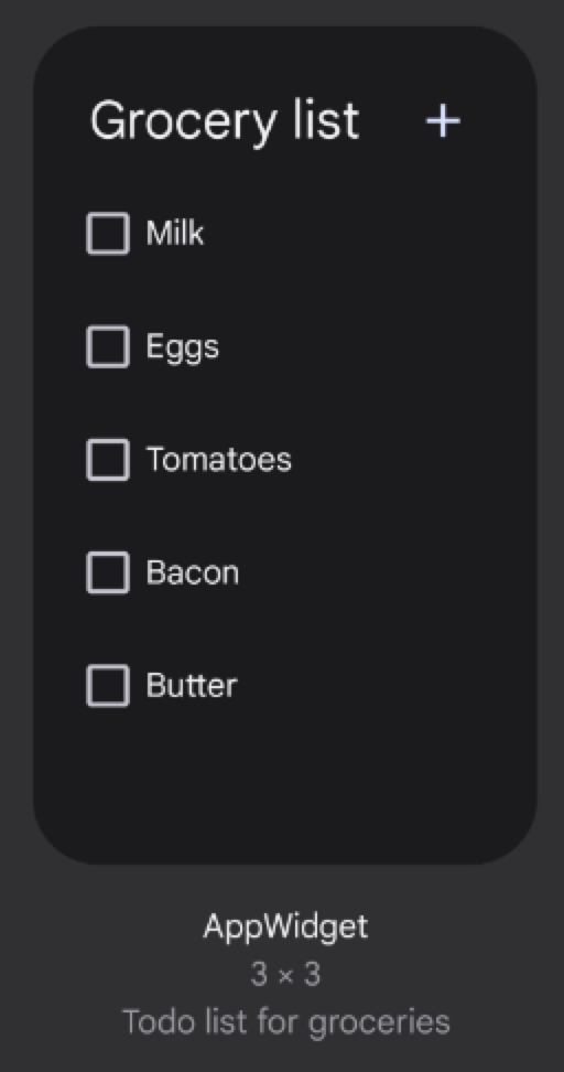
Starting in Android 12, the widget preview displayed in the widget picker is scalable. You provide it as an XML layout set to the widget's default size. Previously, the widget preview was a static drawable resource, in some cases leading to previews inaccurately reflecting how widgets appear when they are added to the home screen.
To implement scalable widget previews, use the
previewLayout
attribute of the appwidget-provider element to provide an XML layout instead:
<appwidget-provider
    android:previewLayout="@layout/my_widget_preview">
</appwidget-provider>
We recommend using the same layout as the actual widget, with realistic default
or test values. Most apps use the same previewLayout and initialLayout. For
guidance on creating accurate preview layouts, see the following section in this
page.
We recommend specifying both the previewLayout and previewImage attributes,
so that your app can fall back to using previewImage if the user's device
doesn't support previewLayout. The previewLayout attribute takes precedence
over the previewImage attribute.
Recommended approaches for building accurate previews
To implement scalable widget previews, use the previewLayout attribute of the
appwidget-provider element to provide an XML layout:
<appwidget-provider
    ...
    android:previewLayout="@layout/my_widget_preview">
</appwidget-provider>

To display an accurate preview, you can directly provide the actual widget layout with default values by completing the following steps:
Setting
android:text="@string/my_widget_item_fake_1"forTextViewelements.Setting a default or placeholder image or icon, such as
android:src="@drawable/my_widget_icon", forImageViewcomponents.
Without default values, the preview might show incorrect or empty values. An important benefit of this approach is that you can provide localized preview content.
For recommended approaches for more complex previews that contain ListView,
GridView, or StackView, see Build accurate previews that include dynamic
items for details.
Backward compatibility with scalable widget previews
To let widget pickers on Android 11 (API level 30) or lower show previews of your
widget, specify the previewImage
attribute.
If you change the widget's appearance, update the preview image.
Add a name to your widget
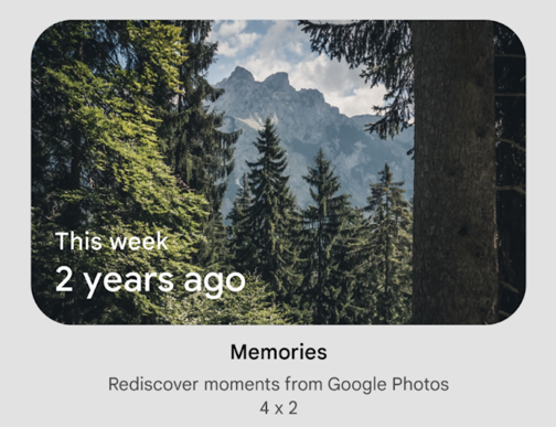
Widgets need to have a unique name when they are displayed in the widget picker.
Widgets' names are loaded from the label attribute of the widget's receiver
element in the AndroidManifest.xml file.
<receiver
    ….
   android:label="Memories">
     ….
</receiver>
Add a description for your widget
Starting in Android 12, provide a description for the widget picker to display for your widget.

Provide a description for your widget using the description attribute of the
<appwidget-provider> element:
<appwidget-provider
    android:description="@string/my_widget_description">
</appwidget-provider>
You can use the
descriptionRes
attribute on previous versions of Android, but it is ignored by the widget
picker.
Enable smoother transitions
Starting in Android 12, launchers provide a smoother transition when a user launches your app from a widget.
To enable this improved transition, use @android:id/background or
android.R.id.background to identify your background element:
// Top-level layout of the widget.
<LinearLayout
    android:id="@android:id/background">
</LinearLayout>
Your app can use @android:id/background on previous versions of Android
without breaking, but it is ignored.
Use runtime modification of RemoteViews
Starting in Android 12, you can take advantage of several
RemoteViews methods that provide for runtime modification of RemoteViews
attributes. See the RemoteViews API
reference for the full list of added methods.
The following code example shows how to use a few of these methods.
Kotlin
// Set the colors of a progress bar at runtime.
remoteView.setColorStateList(R.id.progress, "setProgressTintList", createProgressColorStateList())

// Specify exact sizes for margins.
remoteView.setViewLayoutMargin(R.id.text, RemoteViews.MARGIN_END, 8f, TypedValue.COMPLEX_UNIT_DP)
Java
// Set the colors of a progress bar at runtime.
remoteView.setColorStateList(R.id.progress, "setProgressTintList", createProgressColorStateList());

// Specify exact sizes for margins.
remoteView.setViewLayoutMargin(R.id.text, RemoteViews.MARGIN_END, 8f, TypedValue.COMPLEX_UNIT_DP);
