Carousel is a
motion helper object to build custom carousel views that show a list of elements
that the user can skim through. Compared to other ways to implement such
views, this helper lets you quickly create complex motion and dimension changes
for your Carousel by taking advantage of
MotionLayout.
Carousel
showing landscape pictures.
The Carousel widget supports lists with a start and end as well as circular
wrap-around lists.
How Carousel with MotionLayout works
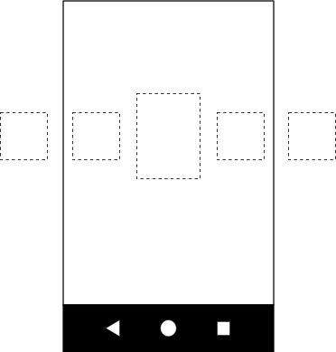
Suppose you want to build a horizontal Carousel view, with the center item
enlarged:

Carousel showing a larger image in the center.
This basic layout contains several views representing the Carousel items:

Create a MotionLayout with the following three states and give them IDs:
- previous
- start
- next
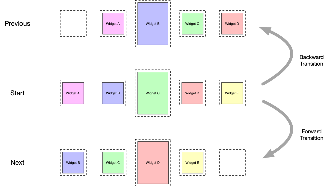
If the start state corresponds to the base layout, in the previous state
and the next state the Carousel items are shifted by one to the left and
to the right, respectively.
For example, take the five views in figure 3 and assume that in the start state, views B, C, and D are visible, and A and E are outside of the screen. Set up the previous state so that the positions of A, B, C, and D are where B, C, D, and E were, with the views moving from left to right. In the next state, the opposite needs to happen, with B, C, D, and E moving to where A, B, C, and D were, and the views moving from right to left. This is shown in figure 4:

Carousel swiping
transitions.
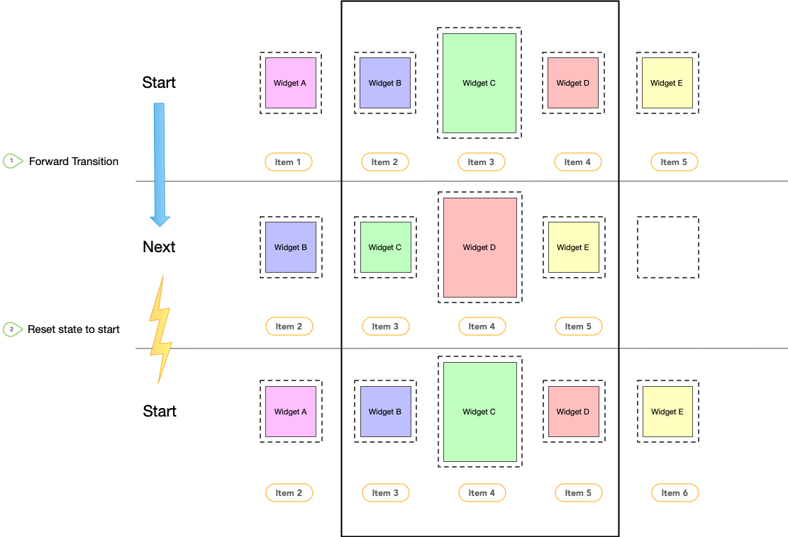
It's critical that the views end up exactly where the original views start.
Carousel gives the illusion of an infinite collection of elements by
moving the actual views back to where they were, but reinitializing them
with the new matching content. The following diagram shows this mechanism. Pay
attention to the "item #" values):

Carousel swiping
transitions and state reset.
Transitions
With these three constraint sets defined in your motion scene file, create two
transitions—forward and backward—between the start and next
states and the start and previous states. Add an
OnSwipe handler to
trigger the transitions in response to a gesture, as shown in the following
example:
    <Transition
        motion:constraintSetStart="@id/start"
        motion:constraintSetEnd="@+id/next"
        motion:duration="1000"
        android:id="@+id/forward">
        <OnSwipe
            motion:dragDirection="dragLeft"
            motion:touchAnchorSide="left" />
    </Transition>

    <Transition
        motion:constraintSetStart="@+id/start"
        motion:constraintSetEnd="@+id/previous"
        android:id="@+id/backward">
        <OnSwipe
            motion:dragDirection="dragRight"
            motion:touchAnchorSide="right" />
    </Transition>
Add the Carousel
After this basic motion scene is created, add a Carousel helper to the layout
and reference the views in the same order you implement your previous and next
animation.
Set the following attributes for the Carousel helper:
app:carousel_firstView: the view that represents the first element of theCarousel—in this example, C.app:carousel_previousState: theConstraintSetID of the previous state.app:carousel_nextState: theConstraintSetID of the next state.app:carousel_backwardTransition: theTransitionID applied between the start and previous states.app:carousel_forwardTransition: theTransitionID applied between the start and next states.
For example, you have something like this in your layout XML file:
    <androidx.constraintlayout.motion.widget.MotionLayout ... >

        <ImageView  android:id="@+id/imageView0" .. />
        <ImageView  android:id="@+id/imageView1" .. />
        <ImageView  android:id="@+id/imageView2" .. />
        <ImageView  android:id="@+id/imageView3" .. />
        <ImageView  android:id="@+id/imageView4" .. />

        <androidx.constraintlayout.helper.widget.Carousel
            android:id="@+id/carousel"
            android:layout_width="wrap_content"
            android:layout_height="wrap_content"
            app:carousel_forwardTransition="@+id/forward"
            app:carousel_backwardTransition="@+id/backward"
            app:carousel_previousState="@+id/previous"
            app:carousel_nextState="@+id/next"
            app:carousel_infinite="true"
            app:carousel_firstView="@+id/imageView2"
            app:constraint_referenced_ids="imageView0,imageView1,imageView2,imageView3,imageView4" />

    </androidx.constraintlayout.motion.widget.MotionLayout>
Set up a Carousel adapter in code:
Kotlin
carousel.setAdapter(object : Carousel.Adapter {
            override fun count(): Int {
              // Return the number of items in the Carousel.
            }

            override fun populate(view: View, index: Int) {
                // Implement this to populate the view at the given index.
            }

            override fun onNewItem(index: Int) {
                // Called when an item is set.
            }
        })
Java
carousel.setAdapter(new Carousel.Adapter() {
            @Override
            public int count() {
                // Return the number of items in the Carousel.
            }

            @Override
            public void populate(View view, int index) {
                // Populate the view at the given index.
            }

            @Override
            public void onNewItem(int index) {
                 // Called when an item is set.
            }
        });
Additional notes
Depending on the current item "selected" in the Carousel, the views
representing the items before or after might need to be hidden to correctly
account for the Carousel start and end. The Carousel helper handles
this automatically. By default, it marks those views as View.INVISIBLE in
these situations, so the overall layout doesn't change.
An alternative mode is available in which the Carousel helper instead marks
those views as View.GONE. You can set this mode using the following property:
app:carousel_emptyViewsBehavior="gone"
Examples
For more examples using the Carousel helper, see the example projects on GitHub.
