The Chip component is an interactive compact element that
represents an input, attribute, or action.
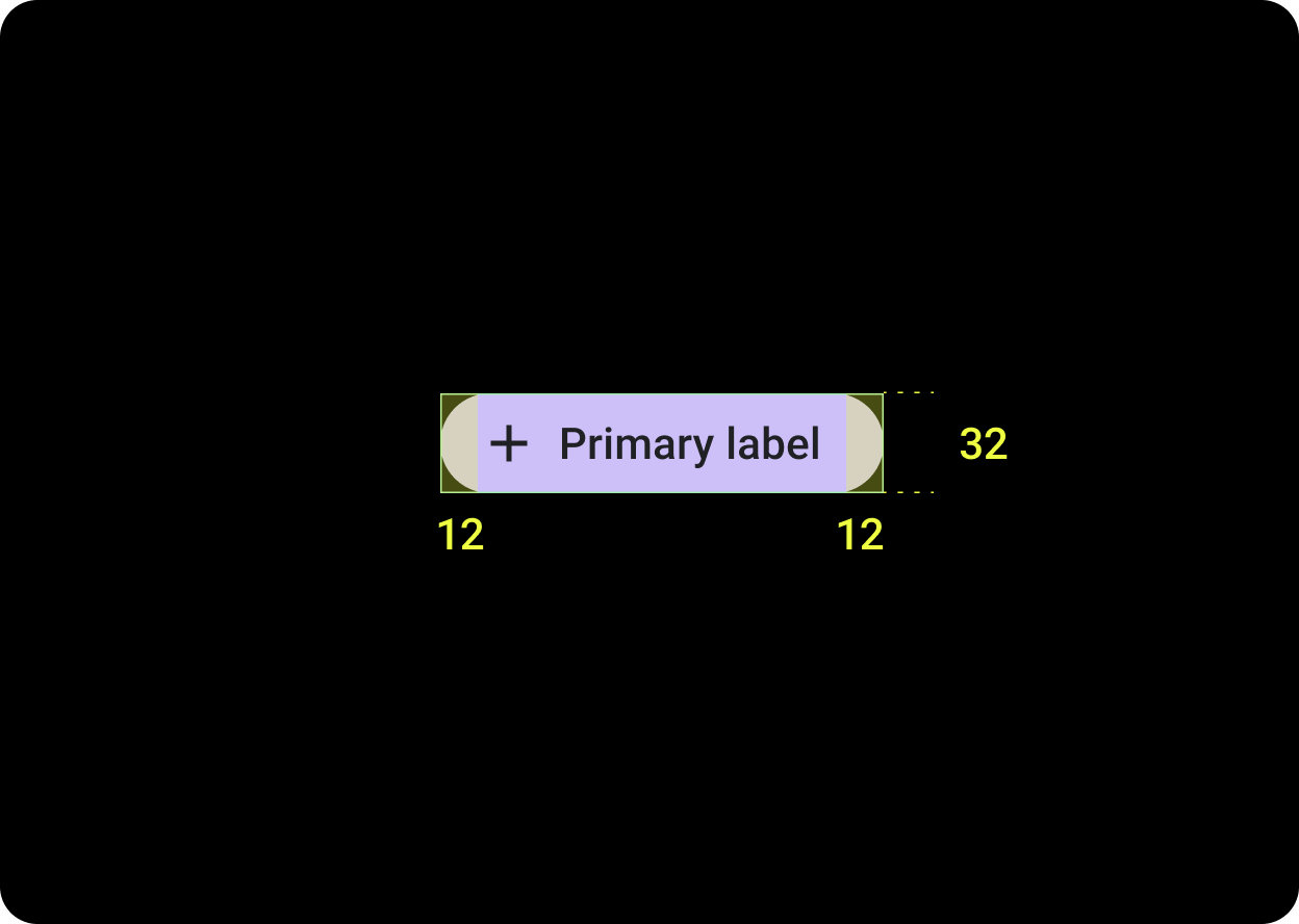
Anatomy
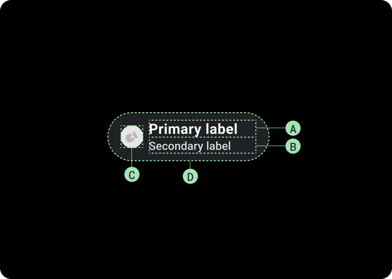
A. Primary label
B. Secondary label (optional)
C. Icon (optional)
D. Container
Design recommendations
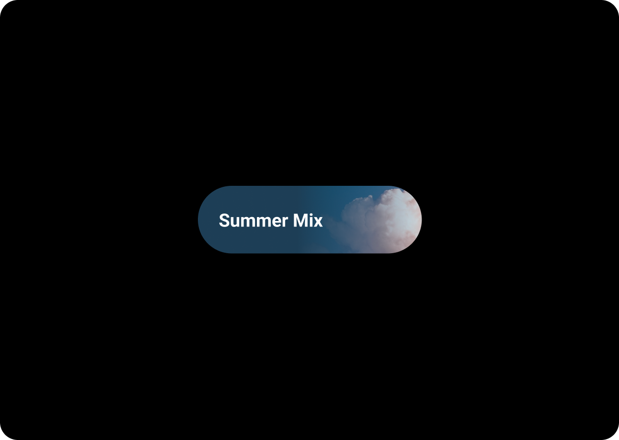
Image chips contain actions which relate to a chosen image. Image chips work well to communicate a more specific look and feel.
Chip(
    ...
    label = {
        Text(
            text = "Summer Mix",
            maxLines = 1,
            overflow = TextOverflow.Ellipsis
         )
    },
    colors = ChipDefaults.imageBackgroundChipColors(
        backgroundImagePainter = painterResource(id = R.drawable.clouds)
    )
)
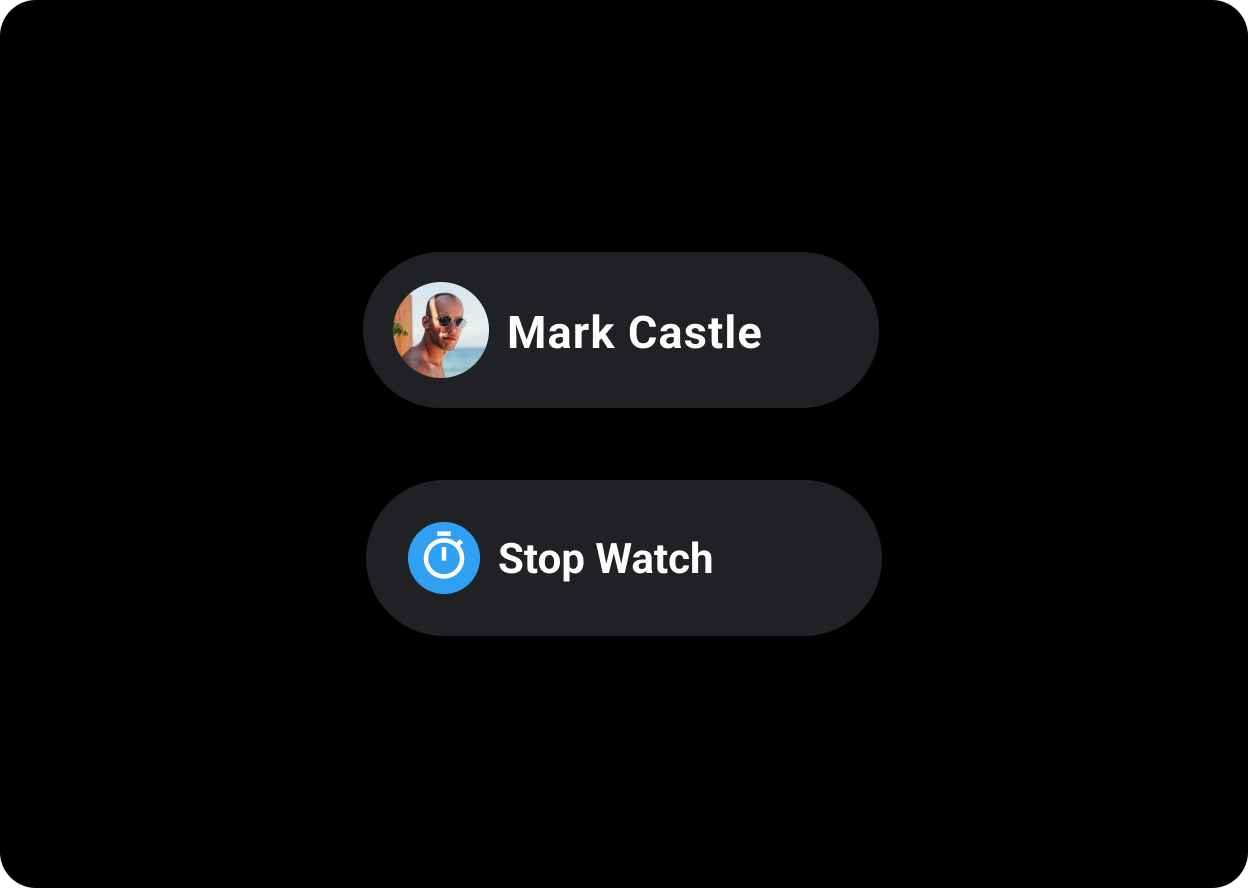
Use avatar chips for actions that are related to a chosen avatar. Avatar chips can also have icons used to make the avatar more easily recognizable, such as a contact ID photo. Avatar icons are 32x32dp.
Chip(
    ...
    label = {
        Text(text = "Mark Castle")
    },
    icon = {
        Icon(
            painter = painterResource(id = R.drawable.avatar),
            contentDescription = null,
            modifier = Modifier.size(ChipDefaults.LargeIconSize)
                .wrapContentSize(align = Alignment.Center)
        )
    }
)
Related components
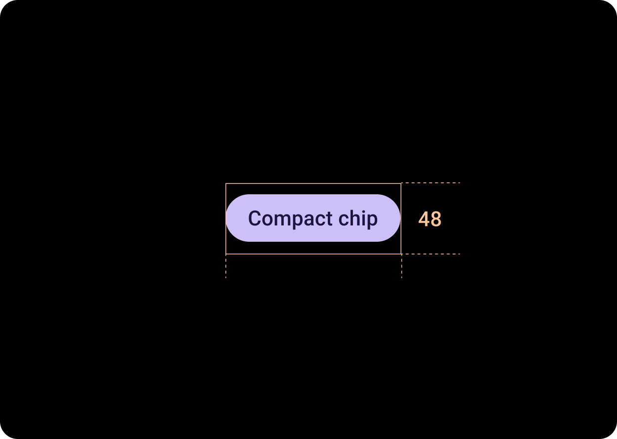
The related component, CompactChip is a variant of the Chip component that appears smaller and is designed for use cases where there is less space. Compact chips have a slot for an icon and a slot for a single line text label. Compact chips have a tappable area with a height of 48dp.
Hierarchy
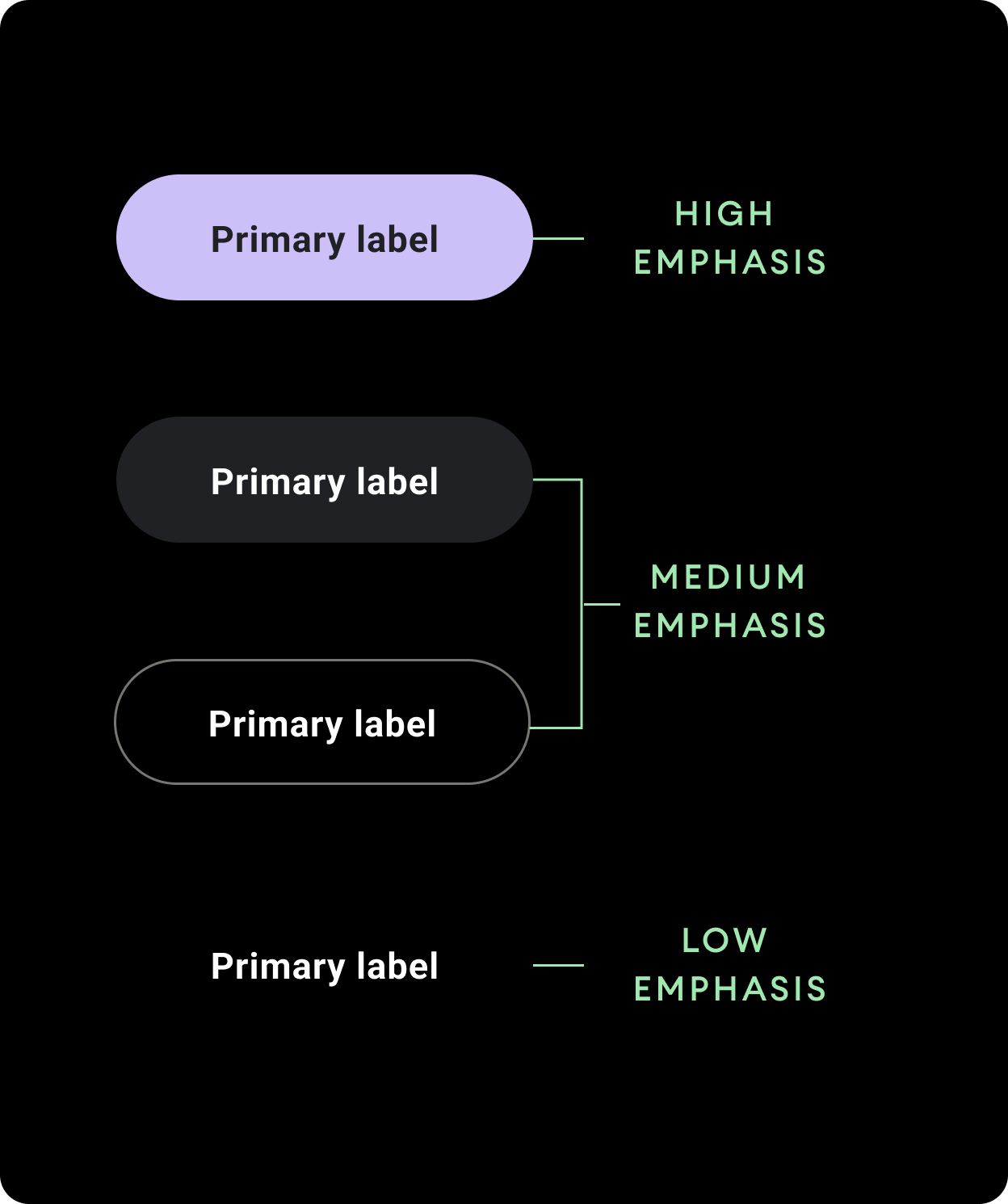
Use different color fills to denote chip hierarchy. Design each screen to contain a single prominent chip for the primary action.
High emphasisUse high-emphasis chips for actions that are primary to the page. Use primary colors as the fill of a high emphasis chip.
Medium emphasis
Use medium emphasis chips for actions that are less important than the primary
actions. Use secondary colors for the fill of a medium emphasis chip.
Alternatively, use the custom OutlinedChip component. The outlined chip has a transparent background, a primary variant colored stroke of 60% opacity, and primary colored content.
Low emphasis
Low emphasis chips have a transparent fill and only a text label. Use low
emphasis chips to indicate a child relationship to a primary or secondary
chip.
Sizes
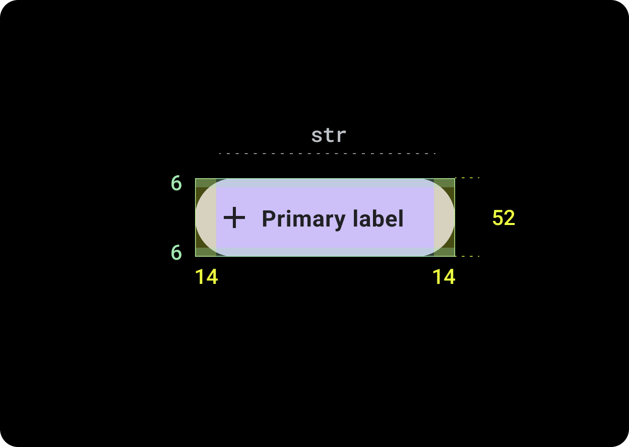
Default chip
Icon: 24dp
Height: 52dp
Compact Chip
Icon: 20dp
Height: 32dp
Tappable area: 48dp
Usage
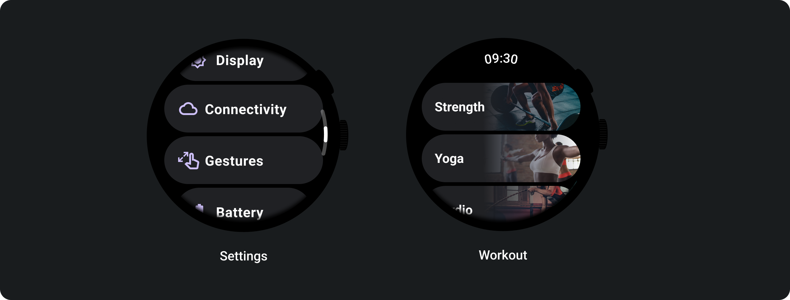
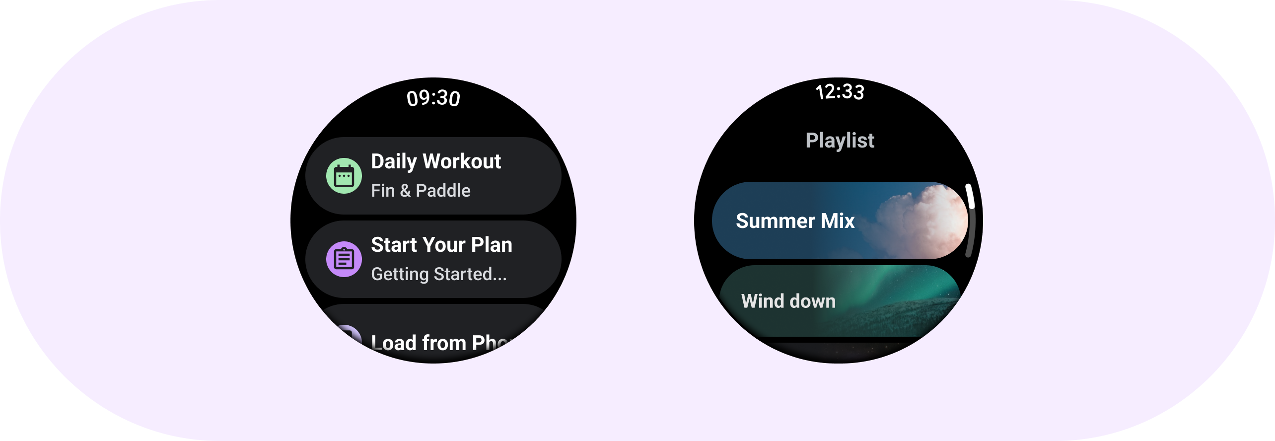
See examples of chip usage such as standard chips in Settings and image chips in an exercise app.