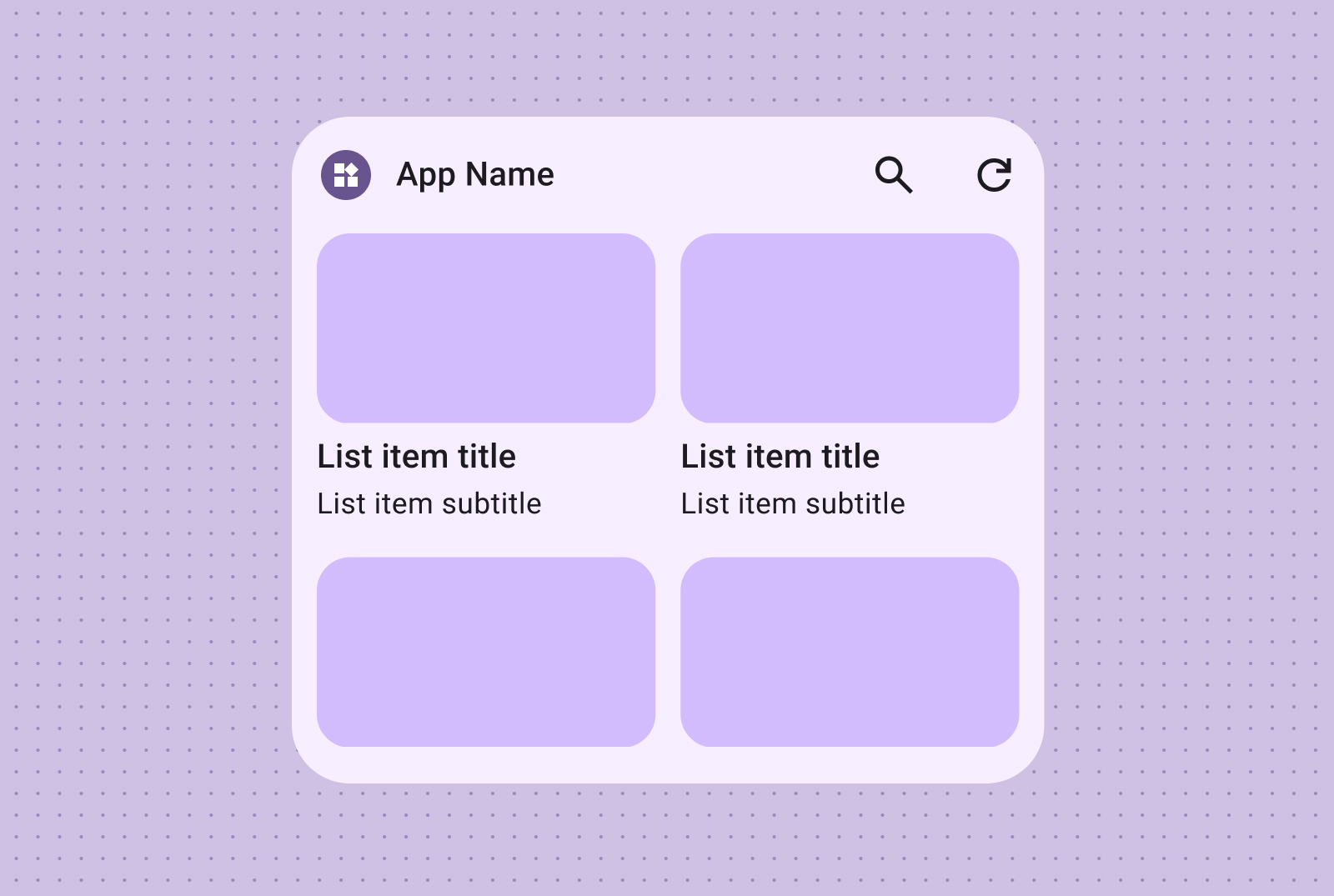
Craft effective widget layouts by first identifying your core content. Your layout dictates how information and interactive elements are organized within your widget. Android offers several prebuilt layouts for toolbars, text, list and grid-type widgets to streamline this process.
Text
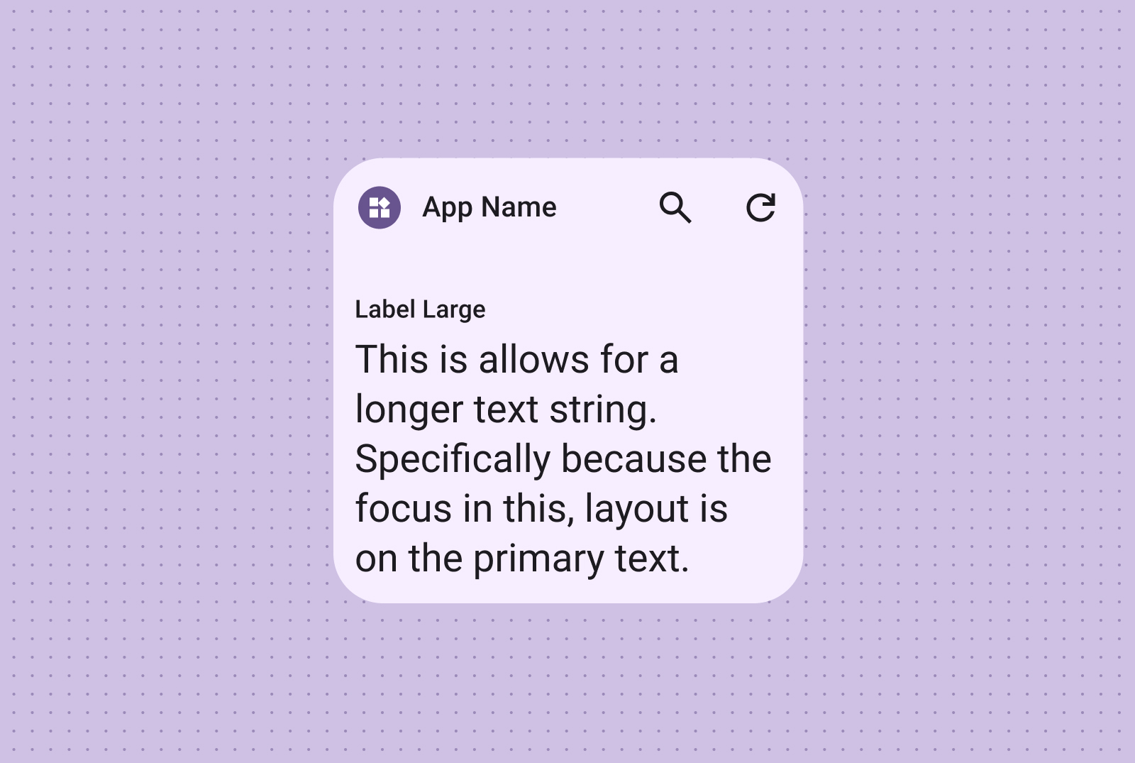
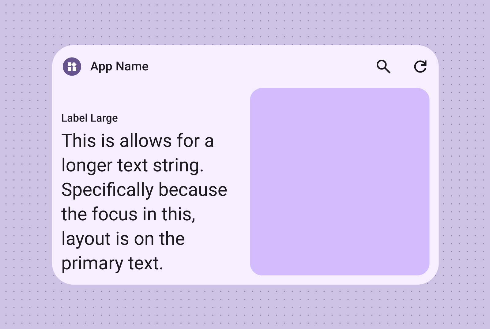
Text layouts are ideal for displaying concise information. Enhance the visual appeal of your widget by optionally including an image alongside the text.
Ideal for titles, status updates, short descriptions, or any scenario where a single line of text effectively conveys the message. Refer to the Canonical layout sample for guidance on dynamically scaling text content based on widget size.
Include an image for added visual impact. For more information, see Breakpoints to learn how to adapt this layout for different screen sizes.
Toolbars
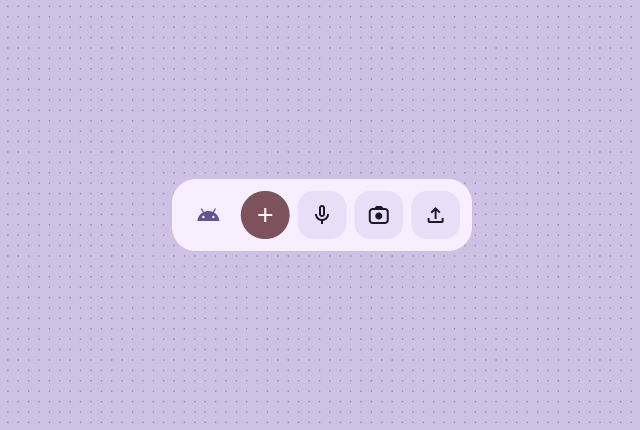
Use toolbar layouts to provide users with quick access to frequently used tasks in your app, in a flexible layout that adapts across widget sizes.
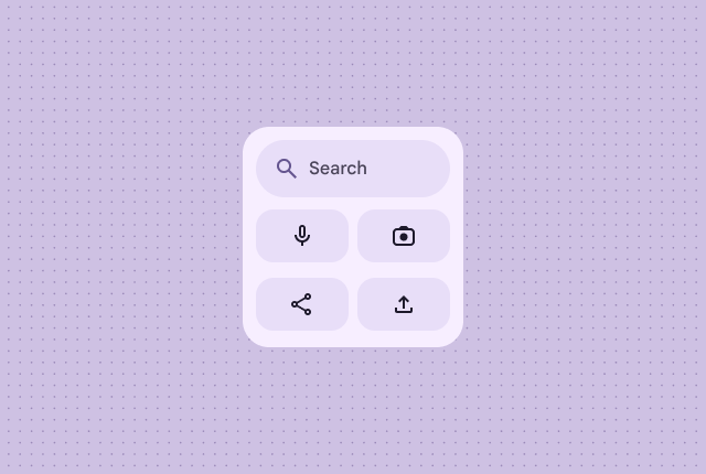
A search toolbar layout is intentionally designed to draw focus to search as a primary action in the toolbar. Additional handy buttons can provide quick access to frequently used functions.
Toolbars presents app branding followed by buttons for the most used tasks that are ideal for toggleable settings or task links. When resizing, less commonly used options can be hidden in favor of more common actions. Use Breakpoints to add a new minimum 48dp tappable button when there's room.
Lists
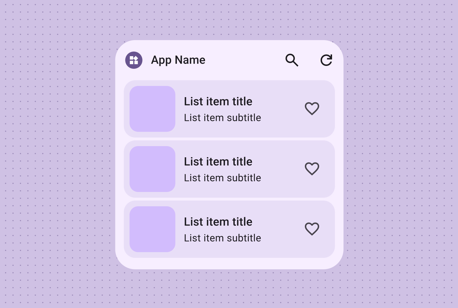
Use list layouts to organize multiple items in a clear, scannable format. This is ideal for news headlines, to-do lists or messages. Organize content into a structured, easily scannable list. Choose between containerized or containerless presentation based on your content needs.
Easily scannable text and image lists are perfect for showcasing multiple content types, such as news headlines, playlists with album art, or messages.
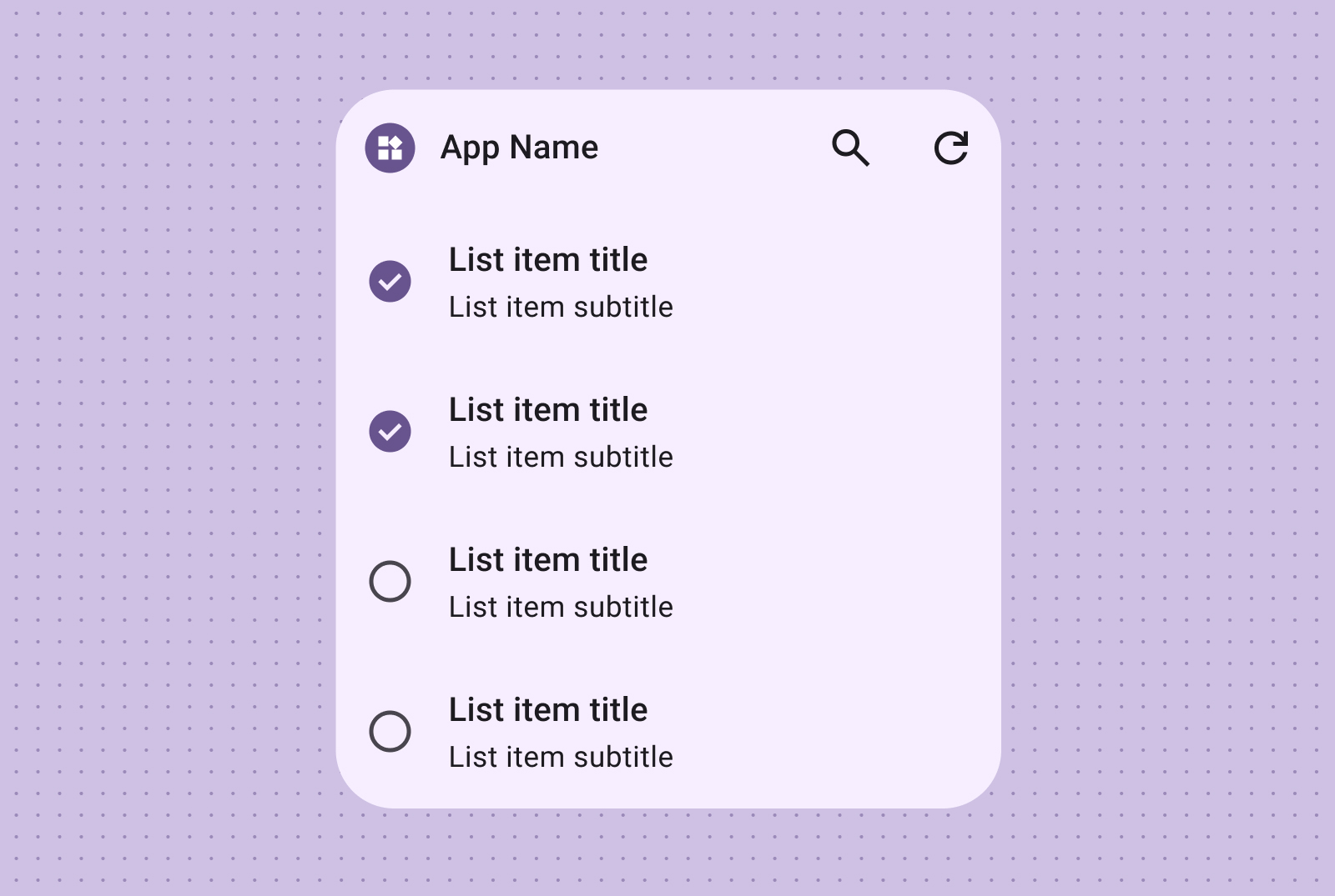
The checklist layout is perfect for displaying tasks, providing clear tap targets for users to easily mark items as done.
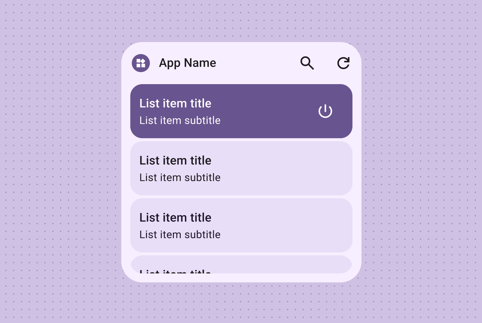
Provide intuitive control grouping with action lists, where visual on/off states offer immediate feedback on item statuses.
Grid
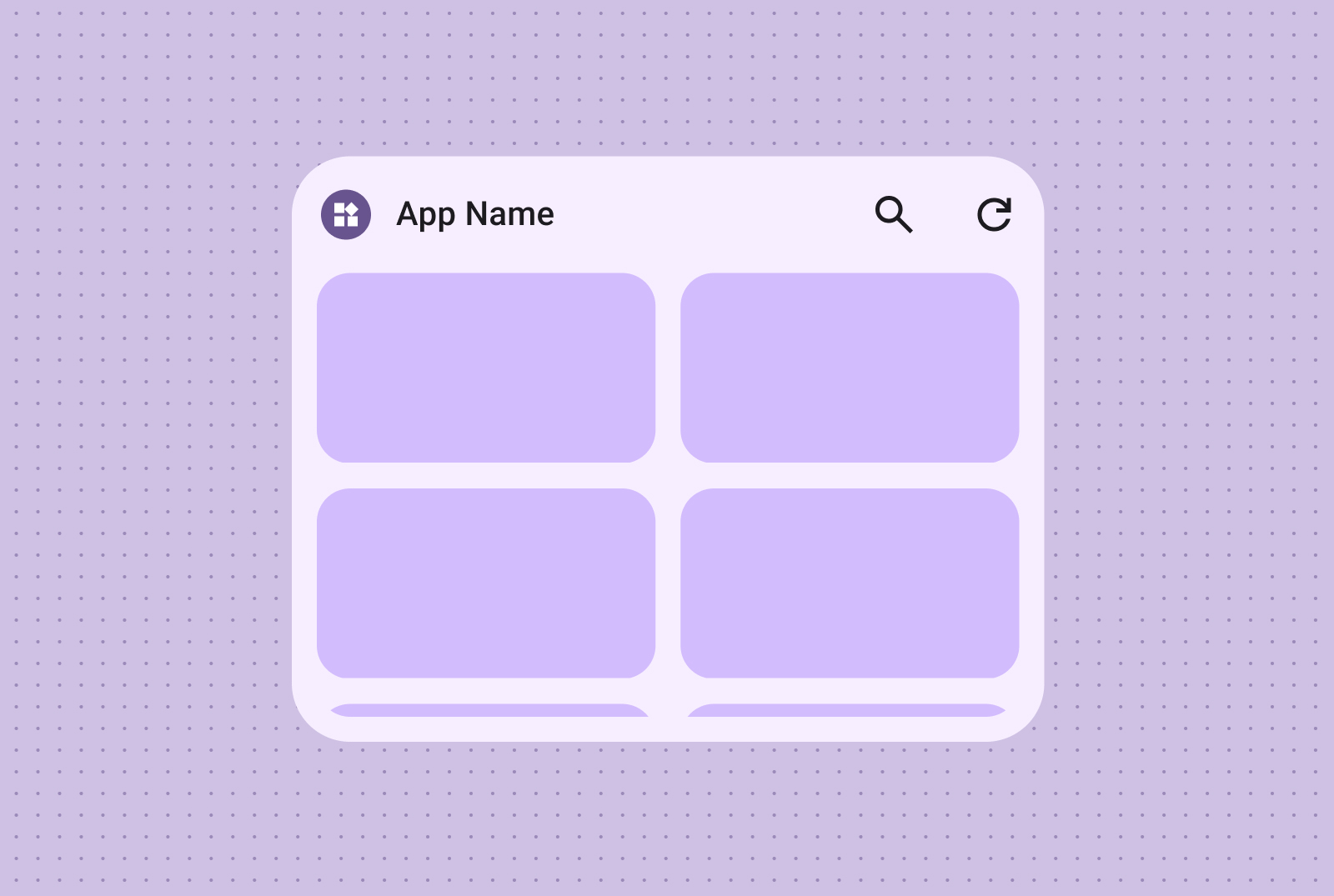
Present images in a compact, flexible, visually rich grid with optional labels. Use columns and rows that adapt to different screen sizes.
Create visually impactful, scrollable image galleries using image-only grids. Rows and columns automatically adapt to various screen sizes for optimal presentation.
You can also incorporate text labels and descriptions, enriching your image grid content with additional context and information.
