

An edge-to-edge app takes advantage of the entire screen by drawing UI under the system bars.
Takeaways
- Draw background and scrolling content underneath system bars for an edge-to-edge experience.
- Avoid adding tap gestures or drag targets under system insets; these conflict with edge-to-edge and gesture navigation.
Draw your content behind the system bars
The edge-to-edge feature lets you draw the UI under the system bars for an immersive experience.
An app can address overlaps in content by reacting to insets. Insets describe how much the content of your app needs to be padded to avoid overlapping with system bars or with physical device features such as display cutouts. Read about how to support edge-to-edge and handle insets in Compose and Views.
Be aware of the following types of insets when designing edge-to-edge use cases:
- System bar insets apply to UI that is both tappable and shouldn't be visually obscured by the system bars.
- System gesture insets apply to gesture-navigational areas used by the OS that take priority over your app.
- Display cutout insets apply to device areas that extend into the display surface, such as the camera cutout.
Status bar considerations
See the Android System Bars for fundamental system bar design guidance. The following section discusses additional status bar considerations.
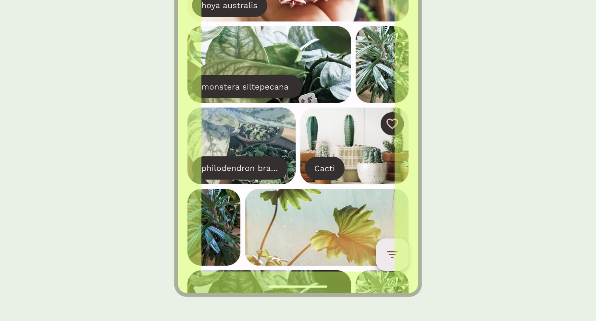
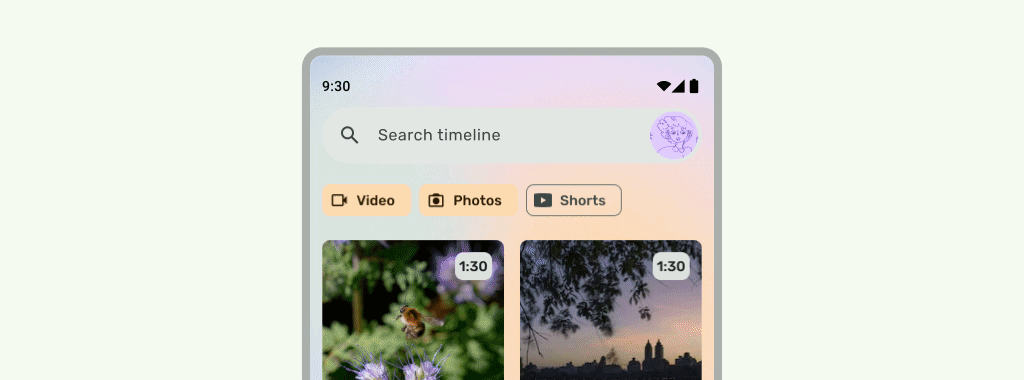
Scrolling content
Top app bars should collapse while scrolling. Learn how to collapse the Material 3 TopAppBar.
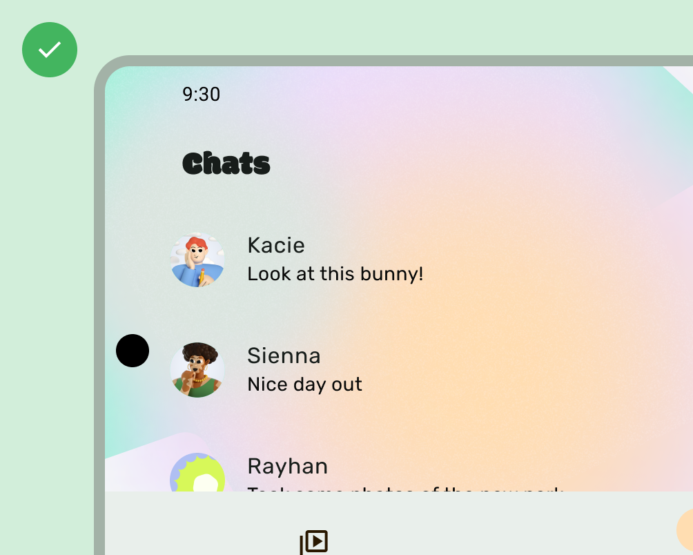
Do
Do
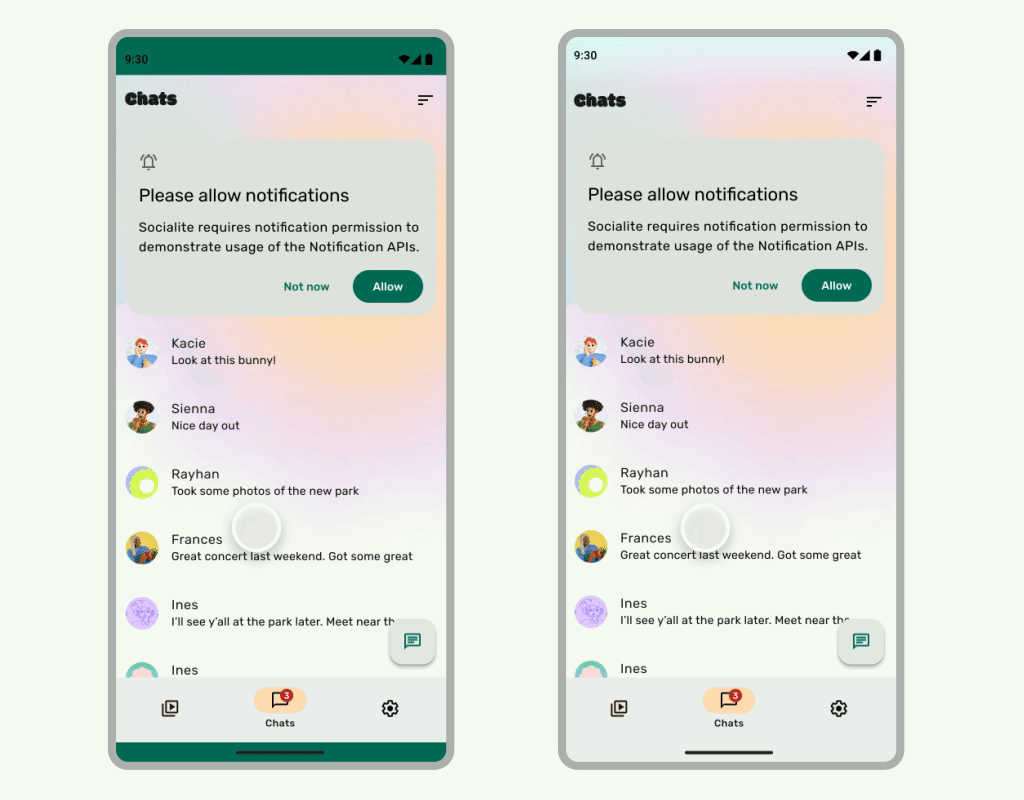
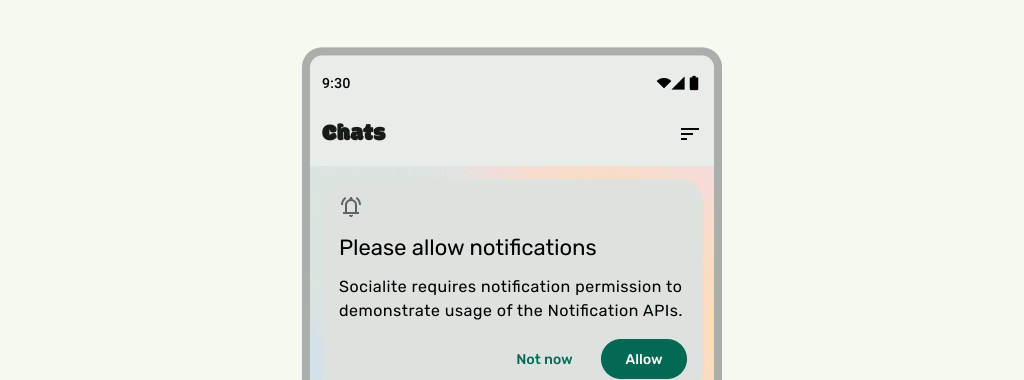
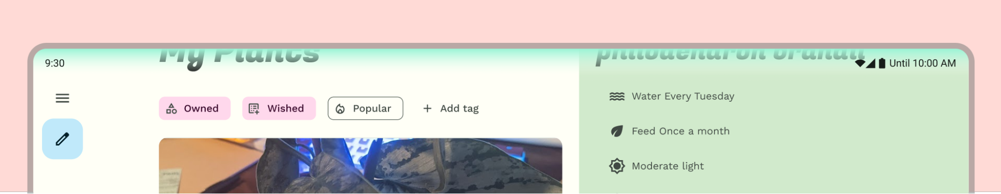
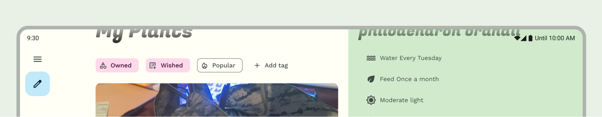
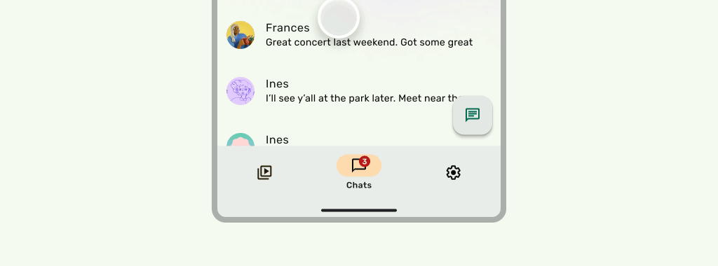
Status bars should be translucent when the UI scrolls underneath, so that the status bar icons don't look cluttered. To accomplish this, first make a scrollable UI edge-to-edge by implementing the steps in the LazyColumn or RecyclerView documentation. Then, ensure the system bar is translucent by doing one of the following:
- Rely on the Material 3 TopAppBar automatic protection when scrolling, if applicable.
- Create a custom composable with 60% alpha or use GradientProtection for Views. For more information on doing this in compose, see System bar protection.

For adaptive layouts, ensure there are separate protections for panes with different background colors.
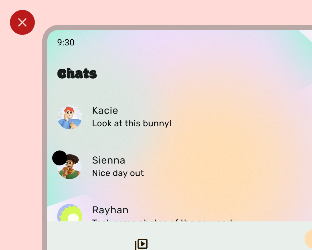
Don´t
Do
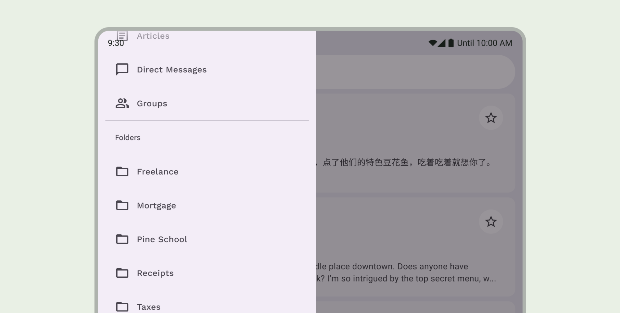
Likewise, navigation drawers should also have a separate protection from the rest of the app.
Don't stack status bar protections, for example by using both the Material 3 TopAppBar built-in protection and a custom protection.
Navigation bar considerations
See the Android System Bars for fundamental navigation bar design guidance. The following section includes additional navigation bar considerations.
Scrolling content
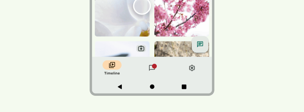
Bottom app bars should collapse while scrolling.
Do
Do
Display cutouts
Display cutouts can affect the appearance of your UI. Apps must handle display cutout insets so that important parts of the UI don't draw underneath the display cutout.
Do
Don´t
However, solid app bar backgrounds should draw into the display cutout as shown in the following image.
Ensure horizontal carousels draw into the display cutout.
Read about how to support display cutouts in Compose and Views.
Other guidance
In general, backgrounds and divider lines should also draw edge-to-edge while content like text and buttons should be inset to avoid the system UI and hardware elements.