Android 13 builds on the tablet optimizations introduced in Android 12 and the 12L feature drop—including optimizations for the system UI, better multitasking, and improved compatibility modes. As part of your testing, make sure your apps look their best on tablets and other large-screen devices.
Get started by setting up a virtual device for the Android Emulator in Android Studio or by getting Android 13 on a large screen device from our device-maker partners.
If you're just getting started with large screens development, check out Large Screens and Foldables guides to read the latest guidance and techniques for building great experiences on these devices.
Here's a look at what's new and some ideas about what to test in your app.
An OS optimized for large screens
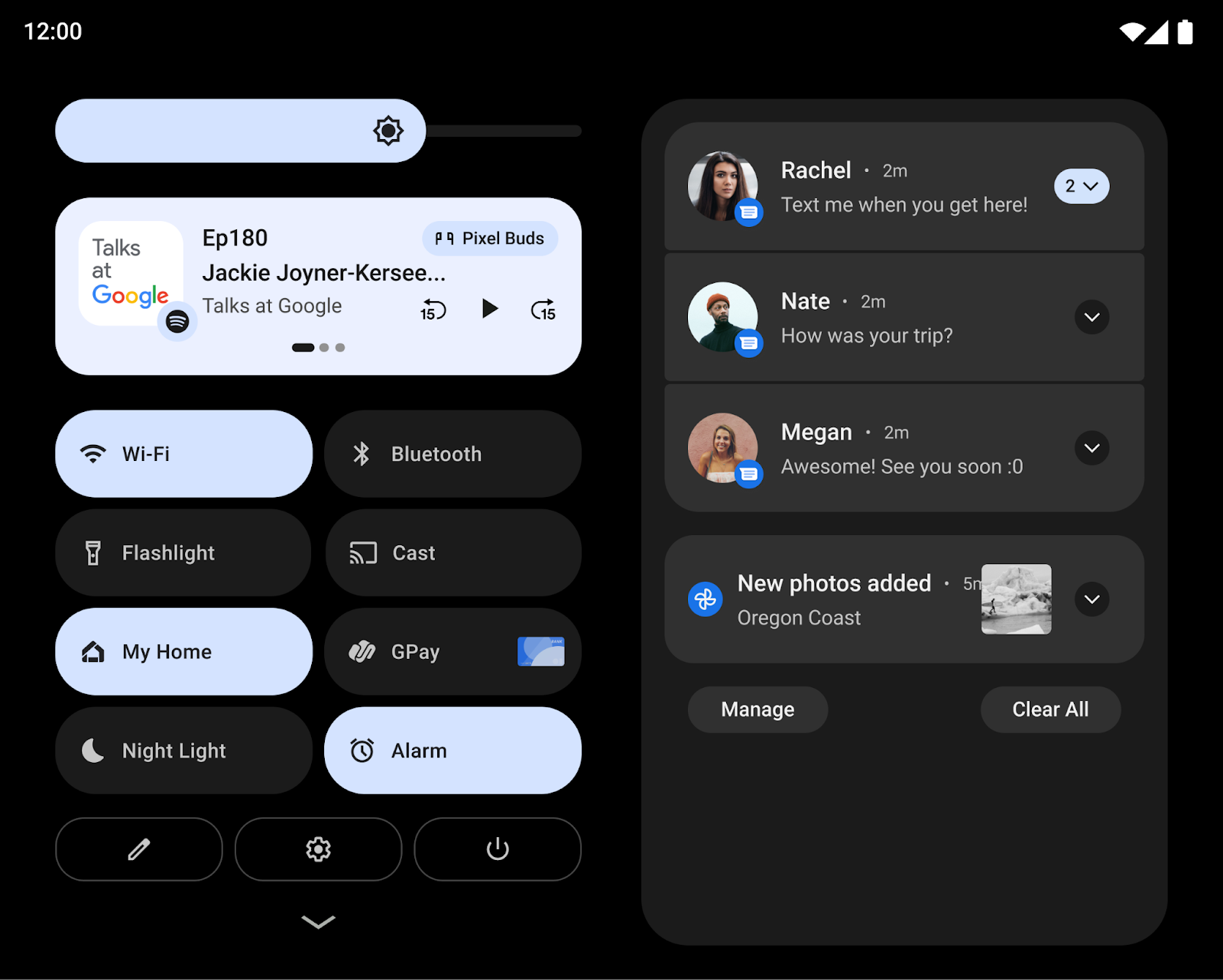
The system UI is now more beautiful and easier to use on large screens—across notifications, quick settings, lockscreen, overview, the home screen, and more.
On large screens, the notification shade takes advantage of the space by showing Quick Settings and notifications in a new two-column layout. The lock screen also uses a larger two-column layout to highlight notifications and clock, and system apps like Settings are also optimized.

Other changes focus on making key interactions easier on larger screens. For example, the lock screen pattern and PIN controls on tablets are now displayed at the side of the screen for easier reach, and users can simply tap the other side of the screen to bring the pin/pattern controls over to that side.
For foldables, the system optimizes the home screen grid and polishes the fold-unfold transition, so that users move seamlessly from a single exterior screen to the larger unfolded screen, reinforcing continuity while preserving their choices.
For developers: Change in media projection
Starting in 12L, when the virtual display is rendered on the surface, the
virtual display is scaled to fit the surface using a process similar to the
centerInside
option of ImageView.
The new scaling approach improves screen casting to televisions and other large displays by maximizing the size of the surface image while ensuring the proper aspect ratio.
For more details, see Media projection on large screens.
Powerful and intuitive multitasking
Users often multitask when using the larger screens of tablets, Chromebooks, and foldables. New productivity features make multitasking even more powerful and intuitive.
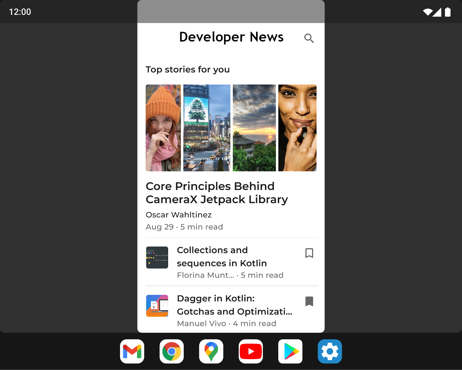
A new taskbar makes it easier to launch and switch apps on the fly. Gestures make using the taskbar even faster, with drag and drop to enter split-screen mode and swipe up to go home. In gesture navigation, a quick-switch gesture lets users flip through recent apps. Users can reveal or hide the taskbar at any time with a long press.
Running apps in split-screen mode is a popular way of multitasking, and split screen is easier than ever to discover and use. Users can now drag and drop their favorite apps into split screen directly from the taskbar, or they can also use a new "Split" action in the overview to start split-screen mode with a tap.
To make split screen a more consistent experience for users, Android 12 and higher allows all apps to enter multi-window mode, regardless of whether they are resizable.
For developers: Test your apps in split-screen mode
With split-screen mode becoming more accessible, and with the change in Android 12 that lets users launch all apps into split-screen, we strongly recommend that you test your apps in split-screen mode.
For developers: Handle dynamic changes in inset sizes
The new Taskbar is reported to applications as an Inset, even though a new inset API has not been introduced.
When used with gesture navigation, the Taskbar can be hidden and shown
dynamically. If your app already uses the inset information to draw its UI,
it needs to take into account the possibility that the size of the inset
may change while the app is in the resumed state. In these cases, your app needs
to call setOnApplyWindowInsetsListener
and handle changes in the inset's dimensions as described in
System bars insets.
Improved compatibility experience
Many apps are already optimized for large screen devices and offer great experiences through responsive layouts, support for multi-window mode, continuity across screen size and device posture changes, and more.
For apps that are not yet optimized, the system includes visual and stability improvements to compatibility mode to provide a better experience for users and make those apps look better by default.

To improve the UI for letterboxing, a number of options are customizable by device manufacturers through overlay configurations. For example, device manufacturers can now configure the app aspect ratio, apply rounded corners to the app window, and set the status bar transparency.
For developers: Check your apps in compatibility mode
If your app isn't yet optimized to adapt to screen size and device posture changes, your app may be launched in compatibility mode. We recommend testing your app with compatibility modes to make sure your app looks and functions properly.
For more details, see Enhanced letterboxing.
Improved palm rejection
Large screens are ideal surfaces for stylus input. But when users draw, write, or interact with your app using a stylus, they sometimes touch the screen with the palm of their hands. The touch event can be reported to your app before the system recognizes and disregards the event as an accidental palm touch.
Prior to Android 13 (API level 33), the system canceled palm touch events by
dispatching a MotionEvent with
ACTION_CANCEL. Android 13
enhances palm rejection identification by adding
FLAG_CANCELED to the
motion event object.
If a palm touch is the only touch event pointer, the system cancels the event by
setting ACTION_CANCEL and FLAG_CANCELED on the motion event object. If other
pointers are down, Android 13 sets
ACTION_POINTER_UP and
FLAG_CANCELED.
For developers: Update your touch event listeners and handlers
On Android 12 (API level 32) and lower, detection of palm rejection is possible
only for single-pointer touch events. If a palm touch is the only pointer, the
system cancels the event by setting ACTION_CANCEL on the motion event object.
If other pointers are down, the system sets ACTION_POINTER_UP, which is
insufficient for detecting palm rejection. In either case, FLAG_CANCELED is
not set.
For Android 13, update your touch event listeners and handlers to check for
FLAG_CANCELED when receiving ACTION_POINTER_UP to ensure palm rejection and
other canceled events are detected and handled.
More updates and resources for large screens
Changes to Google Play on large screens
To make it easier for people to find the best app experiences on their tablets, foldables, and ChromeOS devices, Google Play includes changes to highlight apps that are optimized for their devices.
New checks were added to assess each app’s quality against our large screen app quality guidelines to ensure that Google Play surfaces the best possible apps on those devices. When an app is not optimized for large screens, large screen users now see a notice on the app’s Play Store listing page to help them find apps that will work best on their device.
Play is also introducing large-screen-specific app ratings, as first announced in August 2021, so users will be able to rate how your app works on their large screen devices.
Activity embedding with Jetpack WindowManager
Activity embedding lets you take advantage of the extra display area of large screens by showing multiple activities at once, such as for the List-Detail pattern, and it requires little or no refactoring of your app. You determine how your app displays its activities—side by side or stacked—by creating an XML configuration file or making Jetpack WindowManager API calls. The system handles the rest, determining the presentation based on the configuration you’ve created. If your app uses multiple activities, we recommend giving activity embedding a try. To learn more, see Activity embedding.
Device orientation request
Unlike standard phones, foldables and tablets are frequently used in both landscape and portrait orientations. Tablets are often docked in landscape position, while foldables can be oriented based on their fold.
Some apps request a fixed orientation in portrait or landscape and expect to
remain in their preferred orientation regardless of the orientation of the
device (see the
screenOrientation manifest
attribute). While this is still supported, device manufacturers have the option
of overriding the app’s request for a preferred orientation.
In Android 12 (API level 31) and higher, device manufacturers can configure individual device screens (such as the tablet-size screen of a foldable) to ignore the orientation specification and force an app in portrait mode to be presented upright but letterboxed on landscape displays. By ignoring the specification, Android can better serve the developer’s intention of always presenting an app in a fixed aspect ratio while keeping the app oriented for optimal usability.
However, for the best user experience, design your apps with responsive layouts that make full use of the screen space available in both portrait and landscape orientations on screens larger than 600dp.
Get Android 13 on a large-screen partner device
We've partnered with our device-maker partners to make Android 13 available to try on large-screen devices. Visit the following sites to see a list of their large-screen devices that are eligible and to get details about which Beta builds are available.
For updates and support, see the resources that each device-maker has linked on their Android 13 Beta site. Note that each partner will provide the Beta updates to you directly and handle their own enrollments and support.
What to test
Before you start testing, set up a virtual device for the Android Emulator in Android Studio or get Android 13 on a large screen device from our device-maker partners. After you finish your device setup, you'll want to test your app with some common large screen use cases to make sure that your app responds how you want. Here are a few recommended areas, with links to more details about related resources that can help you optimize your app for large screens:
| What to test | Resources |
|---|---|
|
Screen sizes, device posture, and rotation Check how your app responds when the size of the screen changes due to device posture changes (such as unfolding a foldable device or putting a foldable device in tabletop mode). Also try rotating the device in each of these states to ensure that your app responds optimally. |
Documentation Samples Codelabs Technical talks |
|
Taskbar interaction and split-screen mode Check how your app responds when viewed with the taskbar on large screens. Check that your app's UI isn't cut off or blocked by the taskbar, try entering and exiting split-screen and multi-window modes using the taskbar, and test quickly switching between your app and other apps using the taskbar. If your app has a fixed orientation and is not resizable, check how your app responds to compatibility mode adjustments such as letterboxing. |
Documentation Samples Technical talks |
|
Multi-window mode
Check how your app responds when running in multi-window mode on large
screens (sw >= 600dp), especially if your app sets
If your app sets
If your app uses Display APIs such as
|
Documentation Samples Technical talks |
|
Media projection If your app uses media projection, check how your app responds while playing back, streaming, or casting media on large screen devices. Be sure to account for device posture changes on foldable devices as well. |
Documentation Samples Technical talks |
|
Camera preview For camera apps, check how your camera preview UI responds on large screens when your app is constrained to a portion of the screen in multi-window or split-screen mode. Also check how your app responds when a foldable device's posture changes. |
Documentation |
